Pulso Dashboard: From Zero to a Tested, CI-Ready Dashboard in Under an Hour
Published:
A few months ago I built Pulso, a streaming ETL pipeline that loads 3.4M+ Apple Health records into PostgreSQL. The data was sitting there in normalized tables, ready to be visualized. Today, in a single session of less than one hour, I shipped a complete analytics dashboard: Django backend, React + Chart.js frontend, 23 unit tests, and a CI pipeline — all green and pushed to production.
Here’s what an hour of AI-assisted development looks like.
The Result
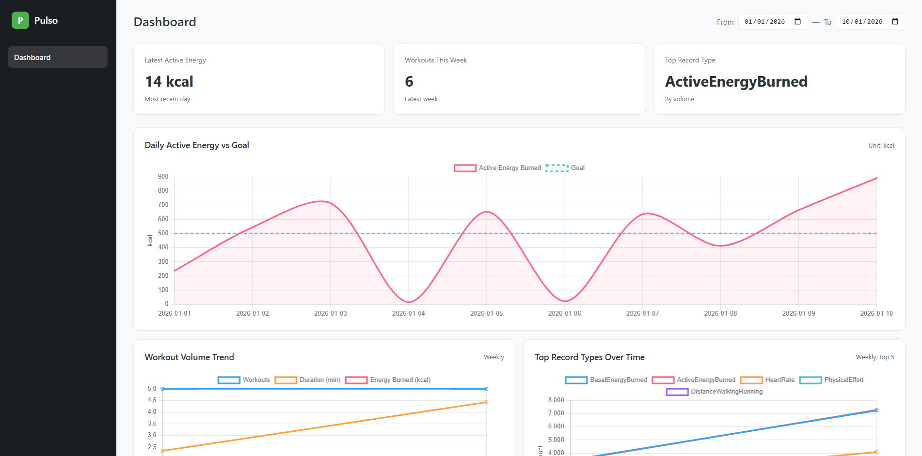
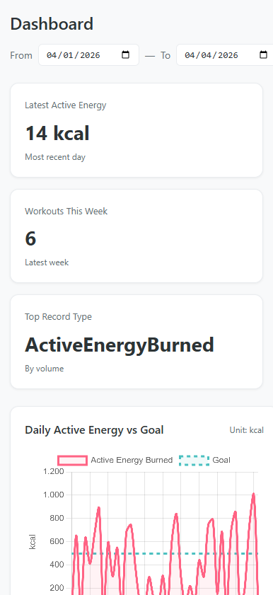
The dashboard surfaces three health metrics I care about: daily active energy vs goal (90 days), workout volume trends (12 weeks), and top record types over time. Three stat cards at the top give you the latest readings at a glance. A date range selector lets you adjust the window.
It’s also fully responsive — the sidebar collapses, stat cards stack vertically, and charts go single-column on mobile:
What Got Built in Under an Hour
Let me break down what was delivered in this session:
Backend (3 API endpoints)
- Django models mapping to the existing ETL tables (
managed = False) - A
PostgresMetricsRepositorywith three methods:get_energy_vs_goal,get_workout_volume,get_top_record_types - Function-based views at
/api/metrics/*with date parameter validation - API integration tests
Frontend (10 React components)
App— dark sidebar shell layoutDashboard— orchestrates stat cards, date range, and chart gridEnergyChart— filled area line chart (energy in coral, goal as dashed teal)WorkoutVolumeChart— weekly multi-line (count, duration, energy)TopRecordTypesChart— top 5 types with auto-stripped Apple Health prefixesChartCard— reusable wrapper handling loading/error/empty/data statesStatCard— metric summary cardDateRangeSelector— date range inputs with onChange callbacksuseChartData— custom hook for API fetching with loading/error management- Full CSS design system with responsive breakpoints
23 Unit Tests (Vitest)
- Hook tests: loading, success, error, URL params
- Component tests: all render states, data transformations, color palettes, label stripping
- Global mock for Chart.js (no canvas dependency)
- All passing locally and in CI
CI/CD
- New
frontend-testjob running in parallel with ETL tests - 13 seconds to run in GitHub Actions
- Both jobs green
Infrastructure
- Docker Compose service for the dashboard
- Vite HMR integration with Django via
django-vite
That’s 10 components, 3 API endpoints, 23 tests, a CI pipeline, and Docker support — in under 60 minutes.
The Speed Multiplier
The session followed a clear pattern: brainstorm, plan, execute, verify. Claude Code handled the implementation while I made architectural decisions and reviewed the output.
The workflow looked like this:
Design phase (~10 min) — We discussed testing strategy: Vitest vs Jest, mock vs canvas rendering, unit vs integration vs hybrid. I chose the approach, Claude wrote the spec.
Planning phase (~5 min) — Claude produced a detailed 10-task implementation plan with exact file paths, code for every step, and verification commands.
Execution phase (~30 min) — Dependencies installed, Vitest configured, all 7 test files written and passing. CI workflow updated. First push to CI failed because the source components weren’t committed yet — caught and fixed immediately.
Verification (~5 min) — All tests green locally, pushed, watched CI pass: frontend in 13s, ETL in 75s. Both green.
The interesting part isn’t just speed — it’s that nothing was cut. The tests are real, the CI is real, the responsive design works. AI didn’t produce a prototype; it produced shippable code with a proper test suite behind it.
The Architecture
PostgreSQL (ETL tables)
    ↓
Django ORM (unmanaged models)
    ↓
Repository layer (aggregation + JSON contract)
    ↓
3 JSON API endpoints
    ↓
React SPA (useChartData hook → Chart.js)
The Django models don’t own the database schema — the Clojure ETL migrations do. Django reads from the same public schema tables with managed = False. The repository layer handles all aggregation and returns a stable JSON contract (labels, datasets, meta) that the frontend consumes directly.
On the frontend, the useChartData hook is the single point of API interaction. Give it an endpoint and a date range, it manages the fetch lifecycle. Each chart component takes the hook’s data and transforms it into Chart.js format — choosing colors, fills, dashed lines, and axis labels.
Testing Strategy
The test design uses a layered mocking approach:
react-chartjs-2— mocked globally.<Line>becomes a<canvas>that captures props. We assert on the data passed to Chart.js, not on pixels rendered.useChartData— mocked per chart test. We control{ data, loading, error }directly, isolating chart rendering from fetching.fetch— mocked only in the hook’s own tests, where fetching is the thing under test.
Each test file has exactly one concern. No test depends on another. No test hits the network.
Running It
# Full stack via Docker
docker compose up db dashboard

# Development with HMR
cd apps/dashboard-django
npm run dev              # Vite on :5173
python manage.py runserver  # Django on :8000

# Tests
npm test                 # 23 tests, <2 seconds
Reflection
When I built the ETL pipeline in February, I wrote about the “afternoon project” as a new reality. This session pushes that further — a full dashboard with backend, frontend, tests, and CI in under an hour. Not a throwaway prototype, but production code with 23 tests and a green CI badge.
The pattern that works: human decides what and how, AI implements it. I chose Vitest over Jest, unit tests over integration, mocked Chart.js over canvas rendering. Claude wrote every test file, configured the CI, and debugged the failures. The division of labor is clear and the output quality is high.
The entire Pulso project — from raw Apple Health XML to a tested, Dockerized, CI-enabled analytics dashboard — was built across a handful of sessions totaling a few hours. That’s the multiplier.
Source: github.com/yagoazedias/pulso